CRANE CAPITAL
Rebranding an investment firm
-
Naming/
Visual Identity/
Website


Partner for Life
Crane Capital is a real estate investment manager working with permanent pension fund capital to build and invest in real estate in Asia. In the light of strategic restructuring, they came to us to create a new name, messaging and website for their firm.
We conducted interviews with the executive team, real estate partners and the Capital investors and identified the driving values of the firm around long term partnership, prosperity, humanity, taking the long term view with permanent capital and the creation of meaningful necessitities.
Crane Capital
We created a short list of names and landed on 'Crane Capital' which embodies the idea of long term partnership (cranes partner for life), progress and building. It is also easily pronounced in multiple languages. We then developed the tagline and communications messages for the brand.
Launching the Crane
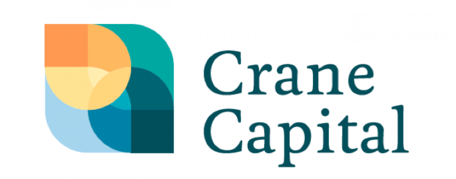
We created the logo for the firm, which visually represents how the different partners, capital and community come together to build prosperity for the long term. The intersecting lines in the middle suggest positivity and also the flourishing petals of a flower. They also show the first letter of the name. The colours are modern, professional and warm also represent the capital's colours. The box shape suggest real estate and buildings.
We then developed the firm's marketing materials and website.
The Crane Capital website can be seen here
"I had the pleasure of working with Georgina and her team at Untapped Branding to conduct a complete overhaul of our brand, Crane Capital. She was highly professional, solutions oriented and fun to work with - and the results were excellent. She's one of the most passionate and expert branding professionals I've met and I strongly recommend her and Untapped Branding to anyone looking to grow their business and brand." Thu Phan, Director at Crane Capital
